
Why Interactive Website Design Matters
How to make an interactive website that truly engages users? Think of your website like a digital experience, not just a collection of pages. Imagine walking into a store where nothing responds, no one greets you, and nothing invites you to explore—you’d leave instantly. The same happens online.
Today’s users expect fast, engaging, and interactive website design experiences. Studies show that over 50% of users leave a website if it takes more than a few seconds to load, and nearly 88% don’t return after a poor user experience. That means your website is not just a digital presence—it’s your first impression, salesperson, and brand identity all in one.
An interactive website keeps users engaged through animations, dynamic content, hover effects, chat support, personalized experiences, and smooth navigation. It turns passive visitors into active participants, improving engagement, retention, and conversions.
In this guide, you will learn how to create an interactive website step by step, the most effective interactive elements, and proven strategies to boost engagement, SEO, and conversions.
What Is an Interactive Website?
An interactive website is a modern web experience that responds to user actions in real time. Instead of static content, users can click, scroll, hover, and interact with dynamic elements such as animations, videos, quizzes, and chatbots.
Unlike traditional static websites, interactive websites:
- Respond to user behavior instantly
- Offer personalized experiences
- Include animations and dynamic visuals
- Encourage user engagement and exploration
Some websites show the same interactive elements to all users, while advanced websites adapt content based on user behavior, location, or preferences.
How to Make an Interactive Website: 15 Proven Methods
Below are the most effective and SEO-friendly strategies to build a high-performing interactive website.
1. Add Loading Animations for Better First Impressions
First impressions decide whether a user stays or leaves.
A loading animation for websites improves perceived performance and keeps users engaged while content loads.
Why it matters:
- Reduces bounce rate
- Improves user experience
- Builds anticipation for content
Best practices:
- Keep animations lightweight
- Use progress indicators
- Match branding colors
- Avoid slowing down page speed
A smooth loading animation makes your website feel premium and professional.
2. Use Parallax Scrolling for Depth and Engagement
Parallax scrolling effects create a 3D illusion where background and foreground move at different speeds.
Benefits:
- Enhances storytelling
- Increases user engagement
- Makes websites visually modern
Tips:
- Use subtle motion
- Optimize images for speed
- Ensure mobile responsiveness
- Avoid overuse
Parallax design is widely used in modern interactive web design services for premium brands.
3. Add Hover Animations for Better Interaction
Hover effects are simple but powerful tools in interactive website design.
Why use them:
- Improves navigation clarity
- Encourages clicks
- Adds modern UI feel
Examples:
- Button color change
- Image zoom effect
- Text reveal on hover
These small interactions make your website feel alive.
4. Use Video Backgrounds for Strong Visual Impact
Video backgrounds instantly capture attention and improve storytelling.
Benefits:
- Increases engagement time
- Strengthens brand identity
- Creates premium visual experience
Best practices:
- Compress video files
- Keep loops short
- Disable autoplay sound
- Provide mobile fallback images
This is widely used in high-conversion landing page design.
5. Add Interactive Carousels for Content Display
Carousels allow users to swipe through images, testimonials, or products.
Advantages:
- Saves page space
- Increases interaction
- Improves UX design
Tips:
- Enable manual navigation
- Avoid too many slides
- Optimize image size
Perfect for eCommerce and portfolio websites.
6. Use Sticky Navigation Menus
Sticky menus improve usability by keeping navigation visible at all times.
Benefits:
- Easier browsing
- Better user retention
- Faster navigation
Best practices:
- Keep it minimal
- Ensure mobile compatibility
- Use smooth transitions
This is essential in modern responsive web design.
7. Add Live Chat or Chatbots
Adding chat features improves customer engagement instantly.
Why it works:
- Provides real-time support
- Increases conversions
- Builds trust
Options:
- AI chatbots
- Live chat agents
- Automated FAQs
Chat systems are key in conversion-focused website design.
8. Build Interactive Navigation Systems
Interactive menus enhance user experience and SEO performance.
Features:
- Hover animations
- Mega menus
- Slide-out navigation
Benefits:
- Easier content discovery
- Lower bounce rate
- Better engagement
9. Use Hover Text on Images
This feature displays additional information when users hover over images.
Advantages:
- Clean design
- Better content visibility
- Enhanced UX
Ideal for portfolios and product showcases.
10. Add Expandable Content Sections
Expandable sections help keep pages clean and organized.
Why use them:
- Reduces clutter
- Improves readability
- Enhances UX
Common use cases:
- FAQs
- Product details
- Service descriptions
11. Use Toggle Features for Customization
Toggle switches allow users to change views or settings.
Benefits:
- Improves personalization
- Saves space
- Enhances accessibility
Examples:
- Dark mode toggle
- Price switch (monthly/yearly)
- Content filters
12. Embed Interactive Google Maps
Interactive maps help users find your business easily.
Benefits:
- Improves local SEO
- Enhances trust
- Increases engagement
Best practices:
- Add business details
- Enable directions
- Ensure mobile optimization
13. Use Hover Effects on Buttons and Borders
Small animations can significantly improve user engagement.
Why it matters:
- Encourages clicks
- Improves visual feedback
- Enhances modern UI feel
Keep effects subtle and consistent.
14. Add Slide-In Call-to-Actions (CTAs)
Slide-in CTAs guide users without interrupting their experience.
Benefits:
- Higher conversion rates
- Better engagement
- Improved UX flow
Examples:
- Sign up buttons
- Free trial offers
- Download prompts
15. Use Lazy Loading for Images
Lazy loading improves performance by loading images only when needed.
Advantages:
- Faster website speed
- Better SEO rankings
- Improved user experience
This is essential for modern SEO optimized websites.
Difference Between Interactive and Passive Websites
| Feature | Interactive Website | Passive Website |
|---|---|---|
| Engagement | High | Low |
| User Experience | Dynamic & personalized | Static |
| Functionality | Advanced features | Basic pages |
| Conversion Rate | Higher | Lower |
| Bounce Rate | Lower | Higher |
Interactive websites clearly outperform static websites in engagement and conversions.
Why Interactive Website Design Is Important for SEO & Business Growth
Interactive websites are not just visually appealing—they directly impact business performance.
Key benefits:
1. Higher Engagement
Interactive elements increase time spent on site and reduce bounce rates.
2. Better SEO Performance
Google favors websites with strong engagement signals.
3. Increased Conversions
Interactive CTAs, chat systems, and animations boost conversion rates.
4. Strong Brand Identity
Memorable experiences improve brand recall and trust.
5. Higher Social Sharing
Engaging content is more likely to be shared on social media.
How to Build an Interactive Website Using Modern Tools
You can create interactive websites using:
- Figma (UI/UX design)
- Webflow (no-code development)
- Spline (3D elements)
- WordPress + Elementor (flexible customization)
These tools allow you to build professional websites without heavy coding.
Final Thoughts:
Creating an interactive website is no longer optional—it is essential for business success in 2026. From animations and hover effects to chatbots and dynamic navigation, every interactive element improves engagement, SEO, and conversions.
If you want your website to stand out in a competitive digital market, focus on building a seamless and interactive user experience that keeps visitors engaged and encourages action.
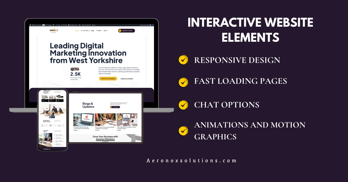
Build Your Interactive Website with Aeronox Solutions
At Aeronox Solutions, we specialize in creating high-performance interactive website design and development services that help businesses grow online.
Our expertise includes:
- Custom Website Design
- Interactive Web Development
- SEO-Optimized Websites
- Brand Identity & Logo Design
- Conversion-Focused Landing Pages
We don’t just build websites—we create interactive digital experiences that convert visitors into customers.